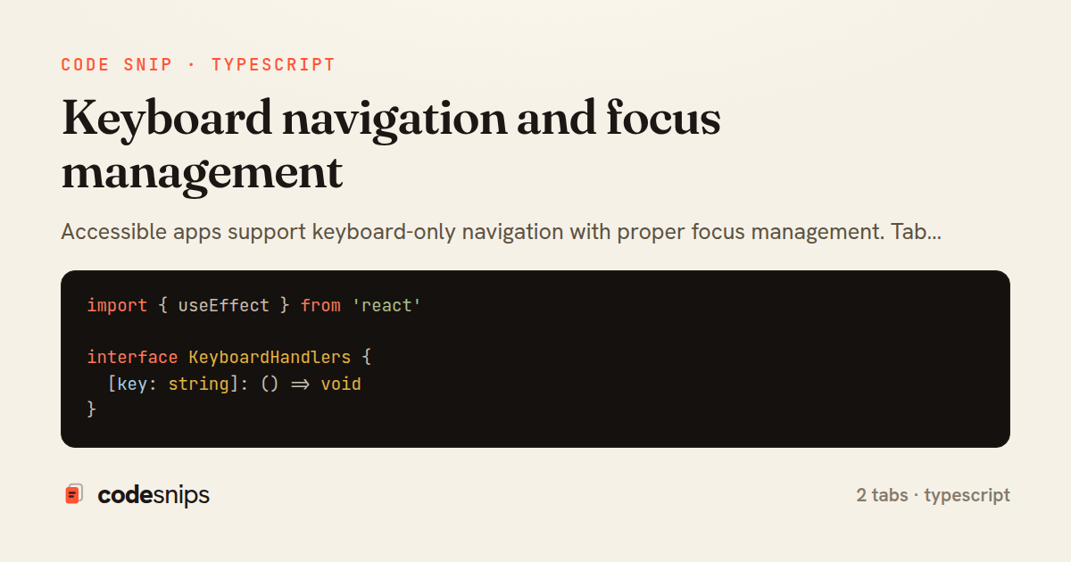
import { useEffect } from 'react'

interface KeyboardHandlers {
  [key: string]: () => void
}

export function useKeyboard(handlers: KeyboardHandlers, enabled = true) {
  useEffect(() => {
    if (!enabled) return

    const handleKeyDown = (e: KeyboardEvent) => {
      const handler = handlers[e.key]
      if (handler) {
        e.preventDefault()
        handler()
      }
    }

    window.addEventListener('keydown', handleKeyDown)
    return () => window.removeEventListener('keydown', handleKeyDown)
  }, [handlers, enabled])
}
import { useState, useRef, useEffect } from 'react'
import { useKeyboard } from '@/hooks/useKeyboard'

interface DropdownProps {
  trigger: React.ReactNode
  items: Array<{ label: string; onClick: () => void }>
}

export function Dropdown({ trigger, items }: DropdownProps) {
  const [isOpen, setIsOpen] = useState(false)
  const [selectedIndex, setSelectedIndex] = useState(0)
  const containerRef = useRef<HTMLDivElement>(null)

  useKeyboard(
    {
      Escape: () => setIsOpen(false),
      ArrowDown: () => setSelectedIndex((i) => Math.min(i + 1, items.length - 1)),
      ArrowUp: () => setSelectedIndex((i) => Math.max(i - 1, 0)),
      Enter: () => {
        items[selectedIndex]?.onClick()
        setIsOpen(false)
      },
    },
    isOpen
  )

  // Focus first item when opened
  useEffect(() => {
    if (isOpen) {
      setSelectedIndex(0)
    }
  }, [isOpen])

  return (
    <div ref={containerRef} className="relative">
      <button
        onClick={() => setIsOpen(!isOpen)}
        aria-expanded={isOpen}
        aria-haspopup="true"
      >
        {trigger}
      </button>

      {isOpen && (
        <div
          role="menu"
          className="absolute top-full mt-2 bg-white rounded shadow-lg border min-w-[200px]"
        >
          {items.map((item, index) => (
            <button
              key={index}
              role="menuitem"
              onClick={() => {
                item.onClick()
                setIsOpen(false)
              }}
              className={`w-full text-left px-4 py-2 hover:bg-gray-100 ${
                index === selectedIndex ? 'bg-gray-100' : ''
              }`}
            >
              {item.label}
            </button>
          ))}
        </div>
      )}
    </div>
  )
}
Accessible apps support keyboard-only navigation with proper focus management. Tab order should follow visual order, and all interactive elements must be keyboard accessible. I use tabIndex={0} to make custom controls focusable and tabIndex={-1} for programmatic focus without tab stops. Arrow keys navigate menus and lists using useKeyboard hooks. Focus moves to opened modals, traps inside them, and returns to the trigger on close. Skip links let keyboard users bypass navigation. The :focus-visible pseudo-class shows focus rings only for keyboard navigation, not mouse clicks. ARIA attributes like aria-label and role provide context for screen readers. Testing with keyboard-only navigation catches most accessibility issues.
Related snips
<!DOCTYPE html>
<html lang="en">
<head>
  <meta charset="UTF-8">
  <meta name="viewport" content="width=device-width, initial-scale=1.0">
  <title>Semantic HTML Example</title>
Semantic HTML5 elements and accessibility best practices
import axios, { AxiosError } from 'axios'
import { v4 as uuidv4 } from 'uuid'

const api = axios.create({
  baseURL: import.meta.env.VITE_API_URL || 'http://localhost:3000/api/v1',
  timeout: 15000,
Axios API client with interceptors
import { create } from 'zustand'
import { persist } from 'zustand/middleware'

interface FilterState {
  search: string
  category: string | null
Zustand for lightweight state management
<!DOCTYPE html>
<html lang="en">
<head>
  <meta charset="UTF-8">
  <title>Form Validation Example</title>
  <style>
HTML forms with validation and accessibility
import { Application } from "@hotwired/stimulus"
import FormSubmitController from "./controllers/form_submit_controller"

const application = Application.start()
application.debug = false
Disable submit button while Turbo form is submitting
import React from "react";

type FallbackProps = {
  error: Error;
  reset: () => void;
};
React Error Boundary + error reporting hook
Share this code
Here's the card — post it anywhere.