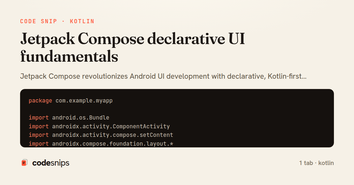
package com.example.myapp

import android.os.Bundle
import androidx.activity.ComponentActivity
import androidx.activity.compose.setContent
import androidx.compose.foundation.layout.*
import androidx.compose.material3.*
import androidx.compose.runtime.*
import androidx.compose.ui.Modifier
import androidx.compose.ui.tooling.preview.Preview
import androidx.compose.ui.unit.dp

class MainActivity : ComponentActivity() {
    override fun onCreate(savedInstanceState: Bundle?) {
        super.onCreate(savedInstanceState)
        setContent {
            MyAppTheme {
                Surface(
                    modifier = Modifier.fillMaxSize(),
                    color = MaterialTheme.colorScheme.background
                ) {
                    PostsList()
                }
            }
        }
    }
}

@Composable
fun PostsList() {
    var posts by remember { mutableStateOf(listOf<Post>()) }
    var isLoading by remember { mutableStateOf(false) }

    LaunchedEffect(Unit) {
        isLoading = true
        // Simulate loading
        kotlinx.coroutines.delay(1000)
        posts = getDummyPosts()
        isLoading = false
    }

    Column(modifier = Modifier.fillMaxSize()) {
        TopAppBar(
            title = { Text("Posts") }
        )

        if (isLoading) {
            Box(
                modifier = Modifier.fillMaxSize(),
                contentAlignment = androidx.compose.ui.Alignment.Center
            ) {
                CircularProgressIndicator()
            }
        } else {
            LazyColumn(
                modifier = Modifier.fillMaxSize(),
                contentPadding = PaddingValues(16.dp),
                verticalArrangement = Arrangement.spacedBy(12.dp)
            ) {
                items(posts.size) { index ->
                    PostCard(post = posts[index])
                }
            }
        }
    }
}

@Composable
fun PostCard(post: Post) {
    var isLiked by remember { mutableStateOf(false) }

    Card(
        modifier = Modifier.fillMaxWidth(),
        elevation = CardDefaults.cardElevation(defaultElevation = 4.dp)
    ) {
        Column(modifier = Modifier.padding(16.dp)) {
            Text(
                text = post.title,
                style = MaterialTheme.typography.titleLarge
            )

            Spacer(modifier = Modifier.height(8.dp))

            Text(
                text = post.body,
                style = MaterialTheme.typography.bodyMedium,
                maxLines = 3
            )

            Spacer(modifier = Modifier.height(12.dp))

            Row(
                modifier = Modifier.fillMaxWidth(),
                horizontalArrangement = Arrangement.SpaceBetween
            ) {
                IconButton(onClick = { isLiked = !isLiked }) {
                    Icon(
                        imageVector = if (isLiked) Icons.Filled.Favorite else Icons.Outlined.FavoriteBorder,
                        contentDescription = "Like",
                        tint = if (isLiked) Color.Red else Color.Gray
                    )
                }

                Text(
                    text = post.author,
                    style = MaterialTheme.typography.bodySmall,
                    modifier = Modifier.align(androidx.compose.ui.Alignment.CenterVertically)
                )
            }
        }
    }
}

@Preview(showBackground = true)
@Composable
fun PostCardPreview() {
    MyAppTheme {
        PostCard(
            post = Post(
                id = 1,
                title = "Sample Post",
                body = "This is a sample post body",
                author = "John Doe"
            )
        )
    }
}

data class Post(
    val id: Int,
    val title: String,
    val body: String,
    val author: String
)
Jetpack Compose revolutionizes Android UI development with declarative, Kotlin-first approach. Composable functions annotated with @Composable describe UI based on state. The runtime automatically updates UI when state changes using remember and mutableStateOf. I use Column, Row, and Box for layouts instead of XML. Modifiers chain to customize appearance and behavior—padding(), fillMaxWidth(), clickable(). State hoisting moves state up the tree for reusability. LaunchedEffect and DisposableEffect handle side effects. Material 3 components provide modern, accessible widgets. Compose eliminates findViewById and reduces boilerplate dramatically. Preview annotations enable UI development without running the app.
Related snips
package com.example.myapp

import android.app.Application
import dagger.hilt.android.HiltAndroidApp

@HiltAndroidApp
Dependency injection with Hilt
package com.example.myapp.ui

import androidx.lifecycle.*
import kotlinx.coroutines.launch

class UserViewModel(
LiveData transformations and mediators
<h1>Products</h1>

<%= form_with url: products_path, method: :get,
              data: { turbo_frame: "products_list", turbo_action: "advance" } do |f| %>
  <div class="filters">
    <%= f.text_field :q, value: params[:q], placeholder: "Search products" %>
Frame navigation that targets a specific frame via form_with
package com.example.myapp.utils

import android.os.Build
import android.os.StrictMode
import android.os.Trace
import timber.log.Timber
Performance optimization and profiling
import SwiftUI

struct CardModifier: ViewModifier {
    var backgroundColor: Color = .white
    var cornerRadius: CGFloat = 12
    var shadowRadius: CGFloat = 5
Custom SwiftUI view modifiers for reusability
package com.example.myapp.widget

import android.app.PendingIntent
import android.appwidget.AppWidgetManager
import android.appwidget.AppWidgetProvider
import android.content.Context
App widgets for home screen
Share this code
Here's the card — post it anywhere.