css
260 lines · 1 tab
Alex Chang
Feb 2026
1 tab
/* Basic flexbox container */
.flex-container {
  display: flex;
  /* flex-direction: row | row-reverse | column | column-reverse */
  flex-direction: row; /* default */

  /* justify-content: aligns items on main axis */
  /* flex-start | flex-end | center | space-between | space-around | space-evenly */
  justify-content: space-between;

  /* align-items: aligns items on cross axis */
  /* stretch | flex-start | flex-end | center | baseline */
  align-items: center;

  /* flex-wrap: allows wrapping */
  /* nowrap | wrap | wrap-reverse */
  flex-wrap: wrap;

  /* gap: spacing between items (modern browsers) */
  gap: 1rem;

  /* align-content: aligns wrapped lines */
  /* flex-start | flex-end | center | space-between | space-around | stretch */
  align-content: flex-start;
}

/* Flex items */
.flex-item {
  /* flex: flex-grow flex-shrink flex-basis */
  flex: 1 1 auto; /* grow, shrink, basis */

  /* Or individually */
  flex-grow: 1;     /* grow to fill space */
  flex-shrink: 1;   /* shrink if needed */
  flex-basis: auto; /* initial size */

  /* align-self: override align-items for this item */
  /* auto | flex-start | flex-end | center | baseline | stretch */
  align-self: flex-start;

  /* order: change visual order */
  order: 0; /* default, lower numbers come first */
}

/* Common flexbox patterns */

/* 1. Perfect centering */
.center-both {
  display: flex;
  justify-content: center;
  align-items: center;
  min-height: 100vh;
}

/* 2. Navbar with logo left, menu right */
.navbar {
  display: flex;
  justify-content: space-between;
  align-items: center;
  padding: 1rem;
}

.navbar-menu {
  display: flex;
  gap: 1.5rem;
  list-style: none;
}

/* 3. Card grid with wrapping */
.card-grid {
  display: flex;
  flex-wrap: wrap;
  gap: 1.5rem;
}

.card {
  flex: 1 1 300px; /* min width 300px, can grow */
  min-width: 0; /* fix overflow issues */
}

/* 4. Sidebar layout */
.layout {
  display: flex;
  min-height: 100vh;
}

.sidebar {
  flex: 0 0 250px; /* fixed width, don't grow or shrink */
}

.main-content {
  flex: 1; /* take remaining space */
  padding: 2rem;
}

/* 5. Equal height columns */
.columns {
  display: flex;
  gap: 2rem;
}

.column {
  flex: 1; /* equal width */
  /* All columns automatically same height! */
}

/* 6. Sticky footer */
body {
  display: flex;
  flex-direction: column;
  min-height: 100vh;
}

.main {
  flex: 1; /* push footer to bottom */
}

footer {
  flex-shrink: 0;
}

/* 7. Form with aligned labels and inputs */
.form-row {
  display: flex;
  align-items: center;
  gap: 1rem;
  margin-bottom: 1rem;
}

.form-row label {
  flex: 0 0 150px; /* fixed width labels */
  text-align: right;
}

.form-row input {
  flex: 1; /* flexible input width */
}

/* 8. Media object pattern */
.media {
  display: flex;
  gap: 1rem;
}

.media-image {
  flex-shrink: 0; /* don't shrink image */
}

.media-content {
  flex: 1; /* flexible content */
}

/* 9. Responsive column stacking */
.responsive-flex {
  display: flex;
  flex-wrap: wrap;
  gap: 1rem;
}

.responsive-flex > * {
  flex: 1 1 300px; /* wrap at 300px */
}

/* Stack on mobile */
@media (max-width: 768px) {
  .responsive-flex {
    flex-direction: column;
  }
}

/* 10. Split button group */
.button-group {
  display: flex;
}

.button-group button {
  flex: 1; /* equal width buttons */
}

.button-group button:not(:last-child) {
  border-right: none;
}

/* Auto-margin trick for spacing */
.flex-spacer {
  display: flex;
  align-items: center;
}

.flex-spacer .push-right {
  margin-left: auto; /* push to right */
}

/* Nested flexbox */
.outer-flex {
  display: flex;
  flex-direction: column;
  gap: 1rem;
}

.inner-flex {
  display: flex;
  justify-content: space-between;
  gap: 0.5rem;
}

/* Flexbox with negative margins (overlap items) */
.overlap-flex {
  display: flex;
  margin-left: -0.5rem;
}

.overlap-flex > * {
  margin-left: 0.5rem;
}

/* Responsive utilities */
.flex-row {
  flex-direction: row;
}

.flex-column {
  flex-direction: column;
}

.justify-start {
  justify-content: flex-start;
}

.justify-center {
  justify-content: center;
}

.justify-end {
  justify-content: flex-end;
}

.justify-between {
  justify-content: space-between;
}

.items-start {
  align-items: flex-start;
}

.items-center {
  align-items: center;
}

.items-end {
  align-items: flex-end;
}

.flex-wrap {
  flex-wrap: wrap;
}

.flex-nowrap {
  flex-wrap: nowrap;
}
1 file · css
Explain with highlit
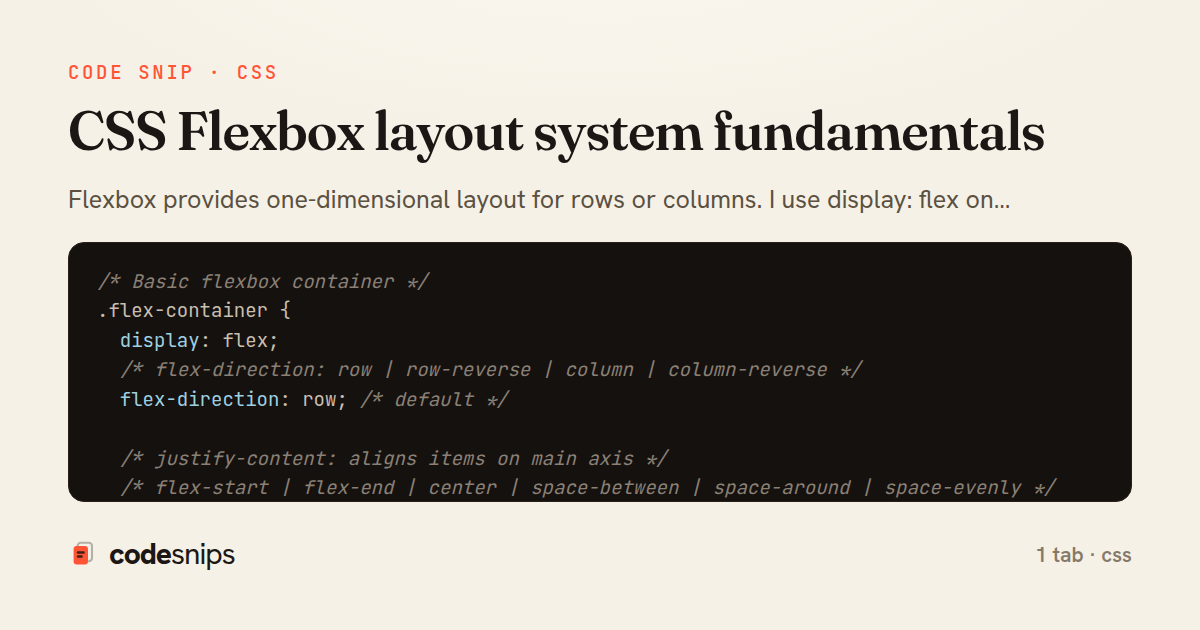
Flexbox provides one-dimensional layout for rows or columns. I use display: flex on containers to enable flexbox. The flex-direction property controls main axis direction (row, column, row-reverse, column-reverse). The justify-content property aligns items along the main axis (flex-start, center, space-between, space-around). The align-items property aligns items on the cross axis. The flex shorthand combines flex-grow, flex-shrink, and flex-basis. Using flex-wrap allows items to wrap to new lines. Flexbox simplifies vertical centering and equal-height columns. Essential for responsive layouts.
Related snips
css
/* Interactive pseudo-classes */
a:link { color: blue; }
a:visited { color: purple; }
a:hover { text-decoration: underline; }
a:active { color: red; }
a:focus { outline: 2px solid orange; }
CSS pseudo-classes and pseudo-elements for advanced styling
css
pseudo-classes
pseudo-elements
by Alex Chang
2 tabs
typescript
import { useEffect, useRef, useState } from "react";

export type AsyncState<T> =
  | { status: "loading" }
  | { status: "error"; error: Error }
  | { status: "success"; data: T };
Frontend: skeleton loading instead of spinners
react
ux
typescript
by codesnips
4 tabs
yaml
web: bin/rails server
css: bin/rails tailwindcss:watch
Tailwind CSS with Rails asset pipeline
tailwind
css
rails
by Jordan Lee
3 tabs
javascript
// Theme switching with CSS variables
const themeToggle = document.getElementById('theme-toggle');
const root = document.documentElement;

// Load saved theme
const savedTheme = localStorage.getItem('theme') || 'light';
CSS custom properties (CSS variables) for dynamic theming
css
variables
custom-properties
by Alex Chang
2 tabs
css
.turbo-progress-bar {
  height: 4px;
  background: linear-gradient(
    90deg,
    var(--progress-start, #6366f1),
    var(--progress-end, #ec4899)
Customize Turbo progress bar styling with Tailwind/CSS
rails
hotwire
turbo
by codesnips
3 tabs
swift
import SwiftUI

// MARK: - Size Preference
struct SizePreferenceKey: PreferenceKey {
    static var defaultValue: CGSize = .zero
SwiftUI PreferenceKey for child-to-parent communication
swift
swiftui
preferencekey
by Sofia Martinez
1 tab
Share this code
Here's the card — post it anywhere.