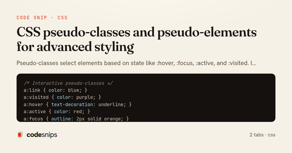
/* Interactive pseudo-classes */
a:link { color: blue; }
a:visited { color: purple; }
a:hover { text-decoration: underline; }
a:active { color: red; }
a:focus { outline: 2px solid orange; }

button:hover {
  background-color: darkblue;
}

button:active {
  transform: scale(0.98);
}

button:focus {
  box-shadow: 0 0 0 3px rgba(66, 153, 225, 0.5);
}

button:focus:not(:focus-visible) {
  box-shadow: none; /* Remove for mouse clicks */
}

button:focus-visible {
  outline: 2px solid blue; /* Only for keyboard focus */
}

/* Structural pseudo-classes */
li:first-child {
  font-weight: bold;
}

li:last-child {
  border-bottom: none;
}

li:only-child {
  text-align: center;
}

p:first-of-type {
  font-size: 1.2rem;
}

p:last-of-type {
  margin-bottom: 0;
}

/* nth-child patterns */
tr:nth-child(odd) {
  background-color: #f9f9f9; /* Zebra striping */
}

tr:nth-child(even) {
  background-color: white;
}

li:nth-child(3) {
  color: red; /* Third item */
}

li:nth-child(3n) {
  /* Every 3rd: 3, 6, 9... */
  font-weight: bold;
}

li:nth-child(3n+1) {
  /* 1, 4, 7, 10... */
  color: blue;
}

li:nth-child(3n+2) {
  /* 2, 5, 8, 11... */
  color: green;
}

div:nth-child(-n+3) {
  /* First 3 elements */
  border-color: red;
}

li:nth-last-child(2) {
  /* Second from last */
  font-style: italic;
}

/* Form pseudo-classes */
input:focus {
  border-color: blue;
  outline: none;
}

input:disabled {
  background-color: #f0f0f0;
  cursor: not-allowed;
}

input:enabled {
  cursor: text;
}

input:read-only {
  background-color: #f9f9f9;
}

input:read-write {
  border: 1px solid #ccc;
}

input:required {
  border-left: 3px solid blue;
}

input:optional {
  border-left: 3px solid gray;
}

input:valid {
  border-color: green;
}

input:invalid {
  border-color: red;
}

input:in-range {
  border-color: green;
}

input:out-of-range {
  border-color: red;
  background-color: #ffe6e6;
}

input[type="checkbox"]:checked {
  background-color: blue;
}

input[type="checkbox"]:indeterminate {
  background-color: gray;
}

option:checked {
  background-color: lightblue;
}

/* Placeholder state */
input:placeholder-shown {
  border-color: #ccc;
}

input:not(:placeholder-shown) {
  border-color: blue;
}

/* Target pseudo-class */
:target {
  background-color: yellow;
  animation: highlight 2s;
}

@keyframes highlight {
  from { background-color: yellow; }
  to { background-color: transparent; }
}

/* Negation pseudo-class */
li:not(.special) {
  color: gray;
}

input:not([type="submit"]):not([type="button"]) {
  padding: 0.5rem;
}

/* Empty pseudo-class */
p:empty {
  display: none;
}

div:empty::before {
  content: "No content available";
  color: gray;
  font-style: italic;
}

/* Modern pseudo-classes */
:is(h1, h2, h3):hover {
  color: blue;
}

:where(article, section) p {
  line-height: 1.6;
}

.card:has(img) {
  display: grid;
  grid-template-columns: 200px 1fr;
}

form:has(input:invalid) {
  border: 2px solid red;
}

label:has(+ input:focus) {
  color: blue;
  font-weight: bold;
}

/* Language pseudo-class */
:lang(en) { quotes: '"' '"'; }
:lang(fr) { quotes: '«' '»'; }

/* User action pseudo-classes */
.tooltip:hover::after {
  content: attr(data-tooltip);
  display: block;
}
/* ::before and ::after */
.icon::before {
  content: "→ ";
  color: blue;
}

.external-link::after {
  content: " ↗";
  font-size: 0.8em;
}

/* Decorative elements */
.quote::before {
  content: open-quote;
  font-size: 2rem;
  color: #ccc;
}

.quote::after {
  content: close-quote;
  font-size: 2rem;
  color: #ccc;
}

/* Creating shapes */
.arrow::after {
  content: "";
  display: inline-block;
  width: 0;
  height: 0;
  border-left: 5px solid transparent;
  border-right: 5px solid transparent;
  border-top: 5px solid black;
  margin-left: 5px;
}

/* Clearfix */
.clearfix::after {
  content: "";
  display: table;
  clear: both;
}

/* Tooltips */
[data-tooltip] {
  position: relative;
}

[data-tooltip]::after {
  content: attr(data-tooltip);
  position: absolute;
  bottom: 100%;
  left: 50%;
  transform: translateX(-50%);
  background: #333;
  color: white;
  padding: 0.5rem;
  border-radius: 4px;
  white-space: nowrap;
  opacity: 0;
  pointer-events: none;
  transition: opacity 0.3s;
}

[data-tooltip]:hover::after {
  opacity: 1;
}

/* Counter */
body {
  counter-reset: section;
}

h2::before {
  counter-increment: section;
  content: "Section " counter(section) ": ";
}

/* Nested counters */
ol {
  counter-reset: item;
}

li::before {
  counter-increment: item;
  content: counters(item, ".") " ";
}

/* ::first-letter and ::first-line */
p::first-letter {
  font-size: 3rem;
  font-weight: bold;
  float: left;
  margin-right: 0.5rem;
  line-height: 1;
}

p::first-line {
  font-weight: bold;
  color: blue;
}

/* ::selection */
::selection {
  background-color: yellow;
  color: black;
}

::-moz-selection {
  background-color: yellow;
  color: black;
}

/* ::placeholder */
input::placeholder {
  color: #999;
  font-style: italic;
  opacity: 1;
}

input:focus::placeholder {
  opacity: 0.5;
}

/* ::marker for lists */
li::marker {
  color: blue;
  font-weight: bold;
}

summary::marker {
  content: "▶ ";
}

details[open] > summary::marker {
  content: "▼ ";
}

/* ::backdrop for fullscreen/dialog */
dialog::backdrop {
  background: rgba(0, 0, 0, 0.5);
  backdrop-filter: blur(5px);
}

/* Form pseudo-elements */
input[type="file"]::file-selector-button {
  background: blue;
  color: white;
  border: none;
  padding: 0.5rem 1rem;
  cursor: pointer;
  border-radius: 4px;
}

input[type="range"]::-webkit-slider-thumb {
  width: 20px;
  height: 20px;
  background: blue;
  border-radius: 50%;
  cursor: pointer;
}

input[type="range"]::-moz-range-thumb {
  width: 20px;
  height: 20px;
  background: blue;
  border-radius: 50%;
  cursor: pointer;
}

/* Scrollbar pseudo-elements */
::-webkit-scrollbar {
  width: 10px;
}

::-webkit-scrollbar-track {
  background: #f1f1f1;
}

::-webkit-scrollbar-thumb {
  background: #888;
  border-radius: 5px;
}

::-webkit-scrollbar-thumb:hover {
  background: #555;
}

/* Combining pseudo-elements with pseudo-classes */
button:hover::before {
  content: "→ ";
}

a:visited::after {
  content: " ✓";
  color: green;
}

input:invalid::after {
  content: " ✗";
  color: red;
}
Pseudo-classes select elements based on state like :hover, :focus, :active, and :visited. I use :nth-child() and :nth-of-type() for pattern-based selection. The :first-child, :last-child, and :only-child target specific positions. Form pseudo-classes include :valid, :invalid, :required, :disabled, and :checked. Pseudo-elements create virtual elements with ::before and ::after using the content property. The ::first-line and ::first-letter style text portions. Using ::placeholder customizes input placeholders. The ::selection changes text highlight colors. Modern ::marker styles list bullets and numbers. The ::backdrop styles fullscreen and dialog backgrounds. Understanding pseudo-classes vs pseudo-elements improves CSS capabilities.
Related snips
import { create } from 'zustand'
import { persist } from 'zustand/middleware'

interface FilterState {
  search: string
  category: string | null
Zustand for lightweight state management
import SwiftUI

struct ContentView: View {
    @State private var username = ""
    @State private var isLoggedIn = false
    @StateObject private var viewModel = LoginViewModel()
SwiftUI declarative UI with state management
<h1>Products</h1>

<%= form_with url: products_path, method: :get,
              data: { turbo_frame: "products_list", turbo_action: "advance" } do |f| %>
  <div class="filters">
    <%= f.text_field :q, value: params[:q], placeholder: "Search products" %>
Frame navigation that targets a specific frame via form_with
import SwiftUI

struct CardModifier: ViewModifier {
    var backgroundColor: Color = .white
    var cornerRadius: CGFloat = 12
    var shadowRadius: CGFloat = 5
Custom SwiftUI view modifiers for reusability
import { useEffect, useRef, useState } from "react";

export type AsyncState<T> =
  | { status: "loading" }
  | { status: "error"; error: Error }
  | { status: "success"; data: T };
Frontend: skeleton loading instead of spinners
import { useEffect, useState } from "react";

export function useDebounce<T>(value: T, delay = 300): T {
  const [debounced, setDebounced] = useState<T>(value);

  useEffect(() => {
Debounced search input (React)
Share this code
Here's the card — post it anywhere.