css
309 lines · 1 tab
Alex Chang
Feb 2026
1 tab
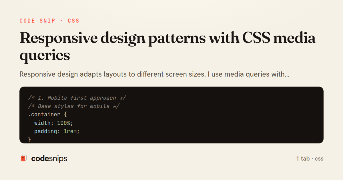
/* 1. Mobile-first approach */
/* Base styles for mobile */
.container {
  width: 100%;
  padding: 1rem;
}

.nav {
  flex-direction: column;
}

/* Tablet and up */
@media (min-width: 768px) {
  .container {
    max-width: 720px;
    margin: 0 auto;
  }

  .nav {
    flex-direction: row;
  }
}

/* Desktop and up */
@media (min-width: 1024px) {
  .container {
    max-width: 960px;
  }
}

/* Large desktop */
@media (min-width: 1280px) {
  .container {
    max-width: 1200px;
  }
}

/* 2. Common breakpoints */
/* Extra small devices (phones, less than 576px) */
@media (max-width: 575.98px) {
  .hide-mobile {
    display: none;
  }
}

/* Small devices (landscape phones, 576px and up) */
@media (min-width: 576px) {
  .col-sm-6 {
    width: 50%;
  }
}

/* Medium devices (tablets, 768px and up) */
@media (min-width: 768px) {
  .col-md-4 {
    width: 33.333%;
  }
}

/* Large devices (desktops, 992px and up) */
@media (min-width: 992px) {
  .col-lg-3 {
    width: 25%;
  }
}

/* Extra large devices (large desktops, 1200px and up) */
@media (min-width: 1200px) {
  .col-xl-2 {
    width: 16.666%;
  }
}

/* 3. Fluid typography */
body {
  /* Scales from 16px to 20px */
  font-size: clamp(1rem, 2.5vw, 1.25rem);
}

h1 {
  /* Scales from 24px to 48px */
  font-size: clamp(1.5rem, 5vw, 3rem);
  line-height: 1.2;
}

/* 4. Responsive images */
img {
  max-width: 100%;
  height: auto;
  display: block;
}

/* Picture element for different image sources */
/*
<picture>
  <source media="(min-width: 1024px)" srcset="large.jpg">
  <source media="(min-width: 768px)" srcset="medium.jpg">
  <img src="small.jpg" alt="Responsive image">
</picture>
*/

/* 5. Flexbox responsive patterns */
.flex-container {
  display: flex;
  flex-wrap: wrap;
  gap: 1rem;
}

.flex-item {
  flex: 1 1 300px; /* grow, shrink, basis */
}

/* Stack on small screens */
@media (max-width: 767px) {
  .flex-container {
    flex-direction: column;
  }
}

/* 6. Grid responsive patterns */
.grid {
  display: grid;
  grid-template-columns: repeat(auto-fit, minmax(250px, 1fr));
  gap: 1.5rem;
}

/* No media queries needed! Auto-responsive */

/* 7. Responsive navigation */
.nav {
  display: flex;
  justify-content: space-between;
  align-items: center;
}

.nav-links {
  display: flex;
  gap: 2rem;
  list-style: none;
}

.menu-toggle {
  display: none;
}

/* Mobile navigation */
@media (max-width: 767px) {
  .nav-links {
    position: fixed;
    top: 60px;
    left: 0;
    right: 0;
    background: white;
    flex-direction: column;
    padding: 2rem;
    transform: translateX(-100%);
    transition: transform 0.3s;
  }

  .nav-links.active {
    transform: translateX(0);
  }

  .menu-toggle {
    display: block;
  }
}

/* 8. Responsive spacing */
.section {
  padding: clamp(2rem, 5vw, 4rem) clamp(1rem, 3vw, 2rem);
}

.grid-gap {
  gap: clamp(1rem, 2vw, 2rem);
}

/* 9. Container queries (modern browsers) */
.card-container {
  container-type: inline-size;
}

@container (min-width: 400px) {
  .card {
    display: flex;
  }

  .card img {
    width: 40%;
  }

  .card-content {
    width: 60%;
  }
}

/* 10. Print styles */
@media print {
  .no-print {
    display: none;
  }

  body {
    font-size: 12pt;
    color: black;
    background: white;
  }

  a {
    text-decoration: underline;
  }

  /* Show URLs after links */
  a[href]::after {
    content: " (" attr(href) ")";
  }
}

/* 11. Dark mode */
@media (prefers-color-scheme: dark) {
  body {
    background: #1a1a1a;
    color: #f5f5f5;
  }

  .card {
    background: #2a2a2a;
    border-color: #3a3a3a;
  }
}

/* 12. Reduced motion */
@media (prefers-reduced-motion: reduce) {
  *,
  *::before,
  *::after {
    animation-duration: 0.01ms !important;
    animation-iteration-count: 1 !important;
    transition-duration: 0.01ms !important;
  }
}

/* 13. Orientation */
@media (orientation: landscape) {
  .landscape-only {
    display: block;
  }
}

@media (orientation: portrait) {
  .portrait-only {
    display: block;
  }
}

/* 14. Aspect ratio */
@media (min-aspect-ratio: 16/9) {
  .widescreen {
    display: block;
  }
}

/* 15. Utility classes */
.hidden-mobile {
  display: none;
}

@media (min-width: 768px) {
  .hidden-mobile {
    display: block;
  }

  .hidden-desktop {
    display: none;
  }
}

/* 16. Responsive tables */
@media (max-width: 767px) {
  table {
    display: block;
    overflow-x: auto;
  }

  /* Stack table on mobile */
  table thead {
    display: none;
  }

  table tr {
    display: block;
    margin-bottom: 1rem;
    border: 1px solid #ddd;
  }

  table td {
    display: block;
    text-align: right;
    padding-left: 50%;
    position: relative;
  }

  table td::before {
    content: attr(data-label);
    position: absolute;
    left: 10px;
    font-weight: bold;
  }
}
1 file · css
Explain with highlit
Responsive design adapts layouts to different screen sizes. I use media queries with @media to apply styles conditionally based on viewport width. Mobile-first approach starts with mobile styles, then adds desktop features. Breakpoints at common device widths (768px tablets, 1024px desktops) create adaptive layouts. The clamp() function provides fluid typography between min and max values. Container queries (modern) respond to parent element width instead of viewport. Flexible images use max-width: 100% to scale. Grid and flexbox provide inherently responsive layouts. Responsive design ensures great experiences across all devices.
Related snips
css
/* Interactive pseudo-classes */
a:link { color: blue; }
a:visited { color: purple; }
a:hover { text-decoration: underline; }
a:active { color: red; }
a:focus { outline: 2px solid orange; }
CSS pseudo-classes and pseudo-elements for advanced styling
css
pseudo-classes
pseudo-elements
by Alex Chang
2 tabs
typescript
import { useEffect, useRef, useState } from "react";

export type AsyncState<T> =
  | { status: "loading" }
  | { status: "error"; error: Error }
  | { status: "success"; data: T };
Frontend: skeleton loading instead of spinners
react
ux
typescript
by codesnips
4 tabs
yaml
web: bin/rails server
css: bin/rails tailwindcss:watch
Tailwind CSS with Rails asset pipeline
tailwind
css
rails
by Jordan Lee
3 tabs
javascript
// Theme switching with CSS variables
const themeToggle = document.getElementById('theme-toggle');
const root = document.documentElement;

// Load saved theme
const savedTheme = localStorage.getItem('theme') || 'light';
CSS custom properties (CSS variables) for dynamic theming
css
variables
custom-properties
by Alex Chang
2 tabs
css
.turbo-progress-bar {
  height: 4px;
  background: linear-gradient(
    90deg,
    var(--progress-start, #6366f1),
    var(--progress-end, #ec4899)
Customize Turbo progress bar styling with Tailwind/CSS
rails
hotwire
turbo
by codesnips
3 tabs
css
/* Basic flexbox container */
.flex-container {
  display: flex;
  /* flex-direction: row | row-reverse | column | column-reverse */
  flex-direction: row; /* default */
CSS Flexbox layout system fundamentals
css
flexbox
layout
by Alex Chang
1 tab
Share this code
Here's the card — post it anywhere.